S R Gopal Rao is an optical store situated at the heart of Bangalore.
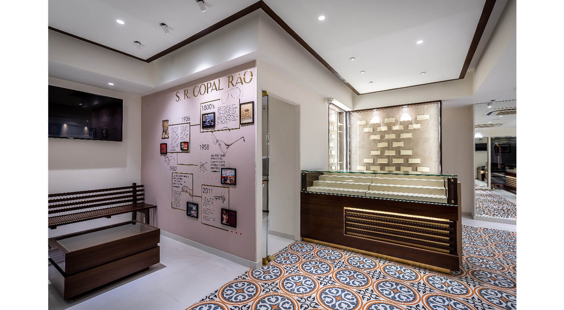
The company itself has a very long and glorious history; it was established in 1936 by the first qualified optometrists in Bangalore and is now run by the fourth generation of pioneers.
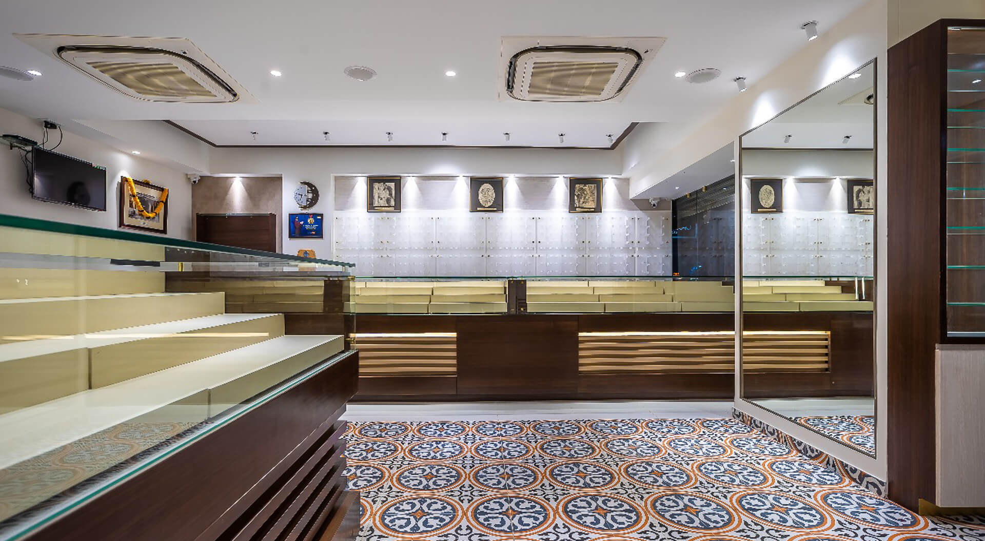
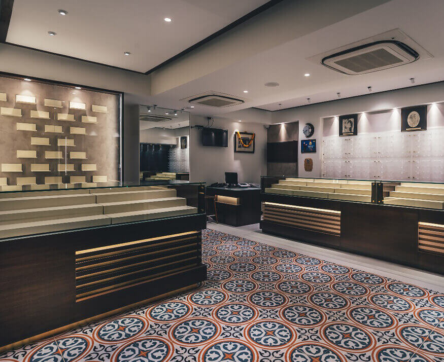
The store is in a very old building and the space was challengingly odd in shape. Some of the basic requirements by the client were to follow Vaastu, to have a traditional look in a modern context due to the history of the brand, and they also had quite a few physical requirement in terms of – a large consultation room which also catered to eye testing, and three sections i.e. a sunglass section, a premium section and a power section. There was also a billing, reception and a waiting space and a standalone display. Pantry, storage and toilets were tucked away at the back.
The biggest challenge for us was to accommodate and distribute the large collection of eyewear into these three sections in such a way which gave each individual section an identity as well as kept the space looking open. The other constraint was also the ceiling which was rather low and air-conditioning and lighting had to be accommodated within that space. So, we zoned it into three spaces and the focal point was on the premium section. We also hid all the services like the pantry and the toilet at the back and the access was not through any section as such, so anybody needing to go to any service would not need to go through any section.
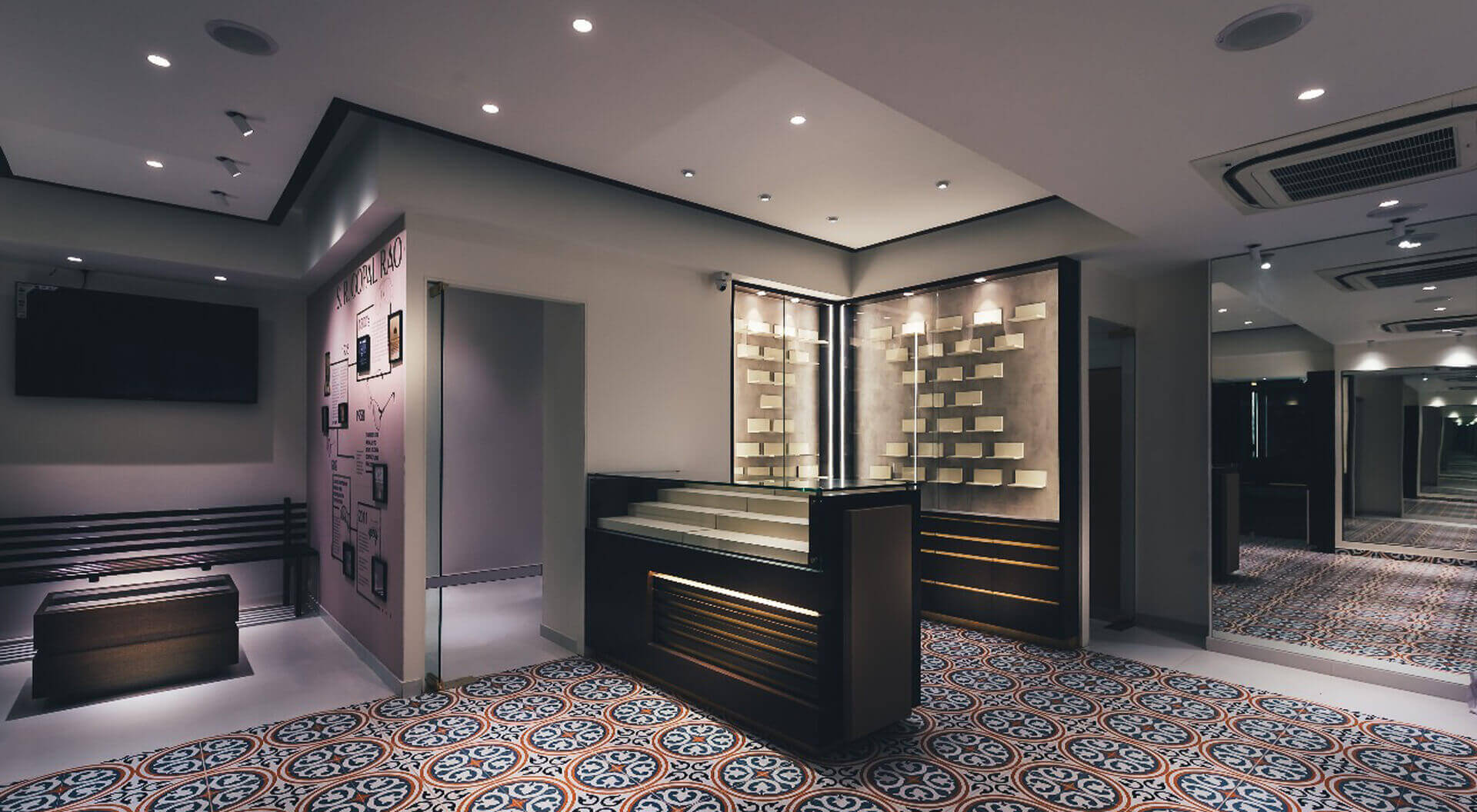
There were two other challenges for each space. First, was to create the right kind of storage – the storage had to be designed in such a way so that a large number of products could be clearly displayed, and, we needed to create the right kind of accessibility for people selling the product, so that it could easily be taken out and put back inside and at the same time we also needed to keep them safe from pilferage, dust and threats. Second, we had a wall display of products where the buyer could touch, feel and try on these glasses without disturbing anyone at the actual storage display.
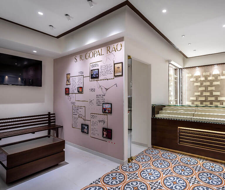
Lighting was also key as it had to focus on the product without creating a glare for the buyer or the person selling the product. In terms of the colour tone we had to be careful that nothing was overpowering because most of the products are transparent and in small frames; each product had to stand out but it had to be in the right kind of environment. We kept the ceiling at one level, we didn’t play with that because we didn’t want to reduce the volume of the space, we wanted it to look large. But we played around with the flooring pattern and also that created a visual access to where we wanted the buyers to actually move and also to accentuate the premium section area. We also used a very light shade of veneer so that even though there was a lot of storage in a very small space it didn’t look cluttered and didn’t look heavy. We also wanted to display the history this company had, as it was very important to the client, they wanted the buyers to understand the legacy of this company and so that was also displayed accordingly. The branding was also done in such a manner so that it was not obtrusive or up in your face; it was done in way so that people would see it but they would also see the product in a greater light.